Logo design.
River & Glen had grown from a small, in-home company, supplying restaurants with high-quality gourmet foods. As they began to grow they felt it necessary to make their respected brand a little more professional.
The Challenge
River & Glen had a logo, but felt that it needed to be more professional to attract the kind of clients they needed. This new identity needed to appeal to professional chefs who would be buying their products, as well as to the quality food suppliers who will sell products to River & Glen. The new identity needed to convey a message of dependability, trust, and quality. It needed to be elegant, clean, contemporary and adaptable to various media. But most importantly, it had to convey to the executive chef that River & Glen was a company that he/she could trust to deliver only the highest quality products.
The Solution
The client did not want to devote a lot of time to designing an icon. So we started with the typography, exploring various fonts, always looking to keep a contemporary feeling. As we worked, we discovered that our thinking was leading to a typographic icon. We selected Trade Gothic Extended as our font. Then we carefully altered the uppercase “G” to give it a bit more rounded appearance. We nestled this type configuration of the two words and ampersand into a square. We then selected a palette of colors to be used in various applications. The result is a clean, compact design that adapts to many uses.
Additional River & Glen projects:
River & Glen logo color palette
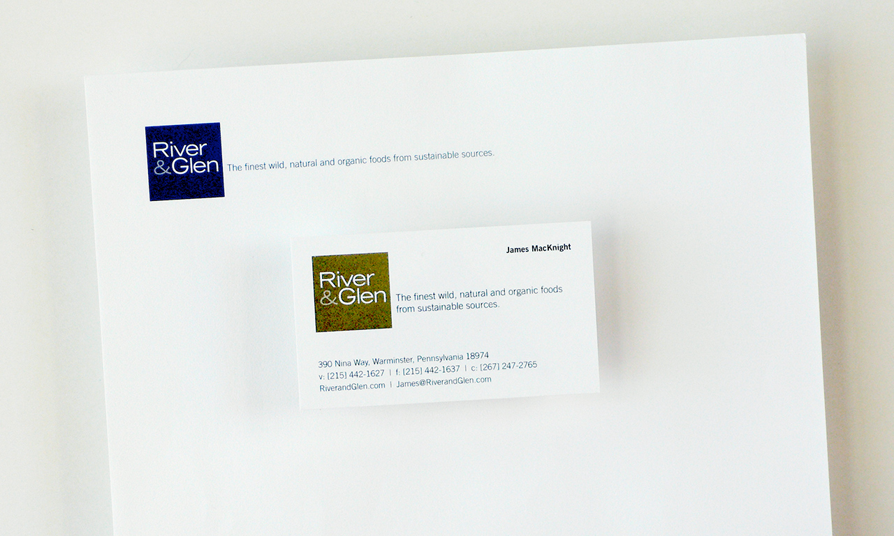
River & Glen stationery

River & Glen product package labels
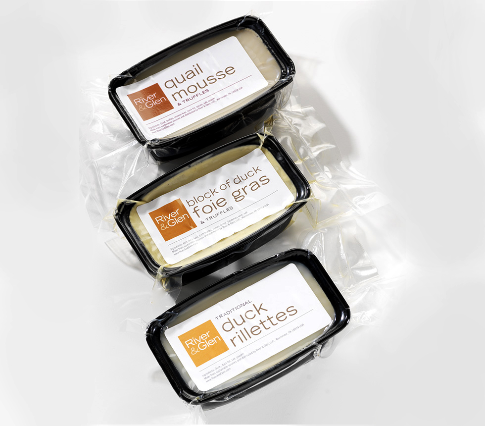
River & Glen product packages


We’re an established marketing and design firm with over 40 years of experience in creating marketing solutions for companies like AstraZeneca, Dow Jones, Merck, and many others in a variety of industries from pharmaceutical to commercial real estate. In both print and digital, our creativity gets results.
© The Steve Williams Design Office, Inc.
FOLLOW US
MEMBER OF
American Institute of Graphic Arts
The Type Directors Club