Name and identity.
When a former client asked us to help him brand his new restaurant, we began at the beginning and suggested a name as well.

The Challenge
Because of our previous relationship with this client, he brought us in at the concept stage. Seeing the success of wine and whiskey bars in cities all around the United States, our client decided that he would develop a “tasting” bar that would feature wine, whiskey and beer. Along with it, a tasting menu of small plates. Each plate could be carefully matched with an appropriate spirit. As a certified sommelier, he wanted his new restaurant to be a place for people to learn about wine, beer and whiskey, and enjoy the experience.
The Solution
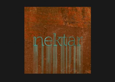
What better word to describe delicious wines, beers and whiskeys than Nectar. When we suggested it, our client seemed to like it immediately, but with one caveat. Being of Greek heritage, he suggested we spell it with a “k” instead of a “c”. Hence, “nektar”.
As we experimented with typography, we noticed that some fonts provided us with a drop shape in the bowl of the lowercase “a”. Using this as a starting point we tried numerous fonts until we arrived at Museo Slab. It’s playful serifs give it a nice friendly appeal. We filled the bowl of the lowercase “a” to simulate a nice golden whiskey.
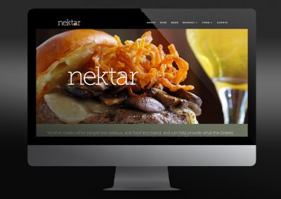
Additional Nektar projects:


We’re an established marketing and design firm with over 40 years of experience in creating marketing solutions for companies like AstraZeneca, Dow Jones, Merck, and many others in a variety of industries from pharmaceutical to commercial real estate. In both print and digital, our creativity gets results.
© The Steve Williams Design Office, Inc.
FOLLOW US
MEMBER OF
American Institute of Graphic Arts
The Type Directors Club

