Brand identity.
When Max Hansen decided to take over the Carversville Store it meant that he needed to separate his various businesses and create an overall brand. Max Hansen Kitchen was born with it’s sub-brands.

The Challenge
The opening of Max Hansen’s Carversville Grocery triggered the need to separate Max’s various business with individual logos, all under one brand. We suggested that the brand could realize more recognition if all the brands had a similar look, creating a family of Max Hansen brands.
The Solution
We presented a number of alternatives, but Max was drawn to the idea of incorporating similar style illustration that represented each of the business entities. For the overall Kitchen brand we created a rack of hanging pots and pans. For the Grocery we decided on a live chicken. For Catering, a server’s hand holding a covered plate, for Max’s Smoked Salmon we of course chose a fish, and finally for Max’s own carved wooden spoons business, we created a drawing of some popular spoon shapes. The typography for each was a simple sans serif font, Proxima Nova Black and Semibold.
Additional Max Hansen Kitchen projects.

Max Hansen Catering ad

Max Hansen Catering ad
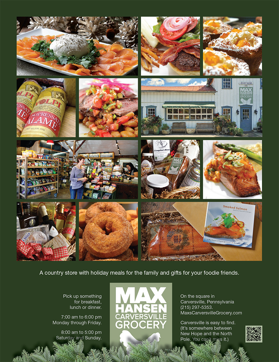
Max Hansen Grocery ad
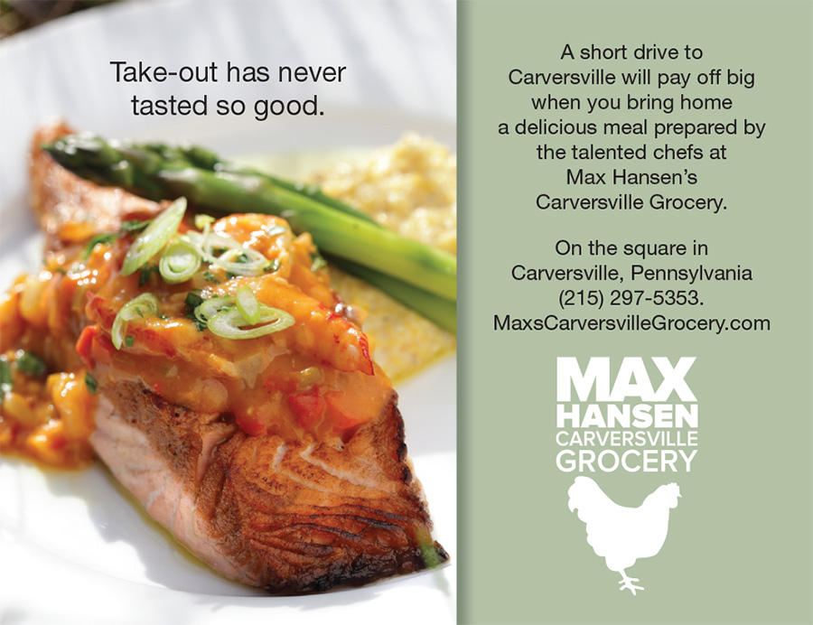
Max Hansen Grocery ad
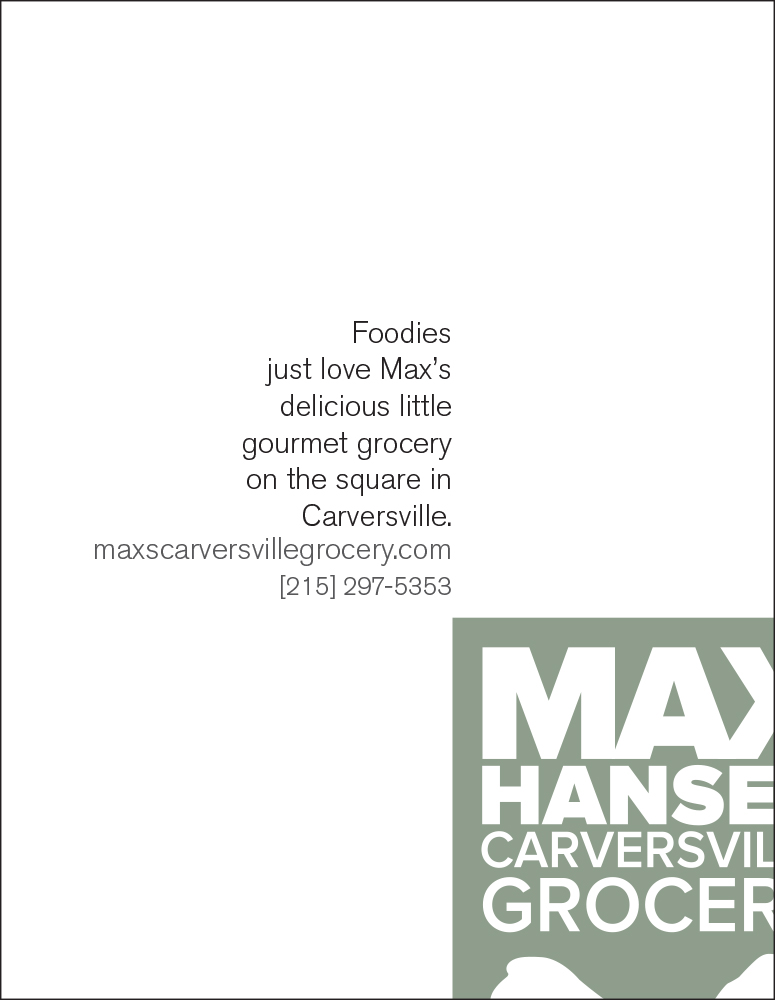
Max Hansen Grocery ad
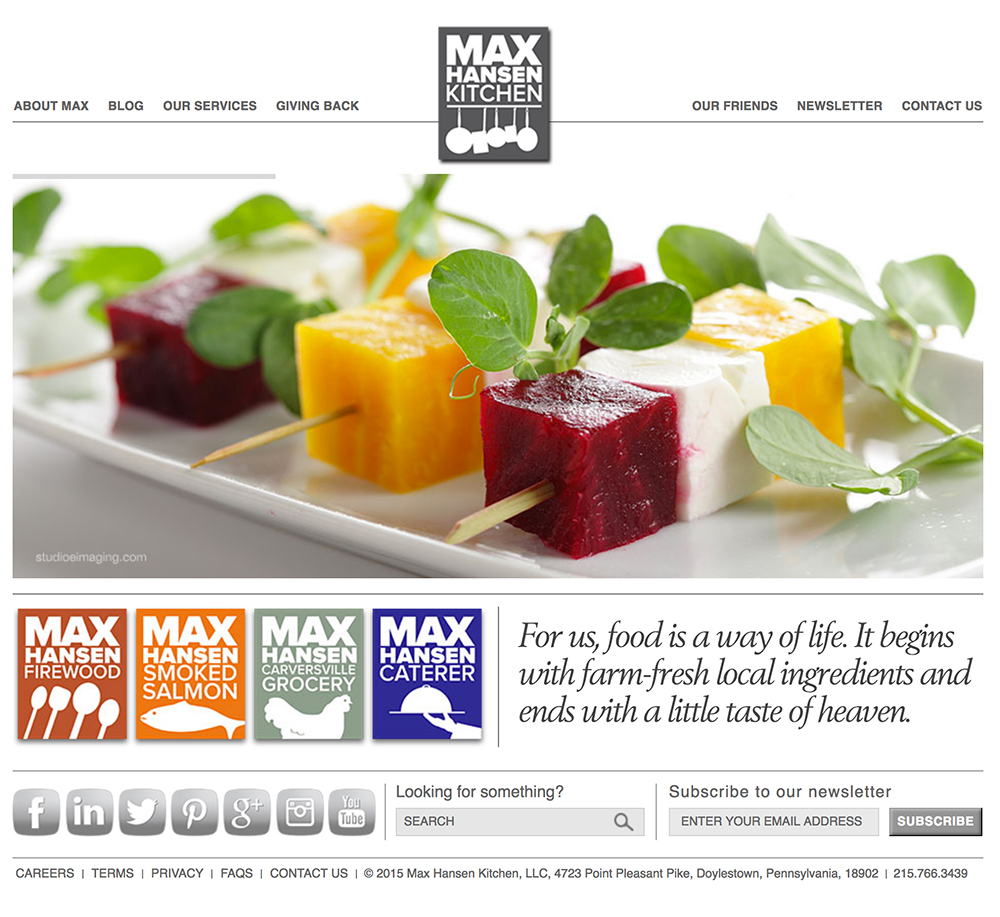
Web Site Max Hansen Kitchen
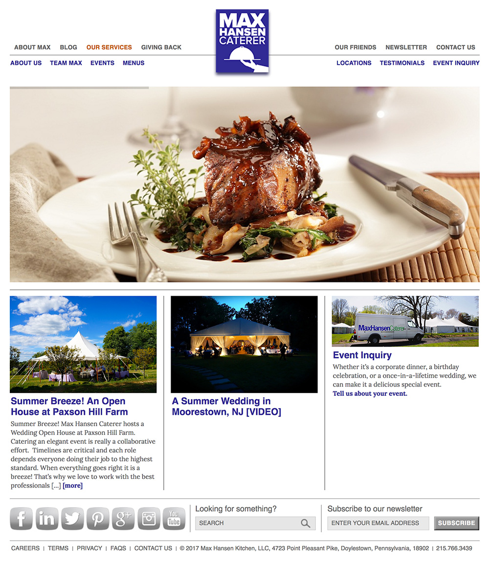
Web Site Max Hansen Caterer
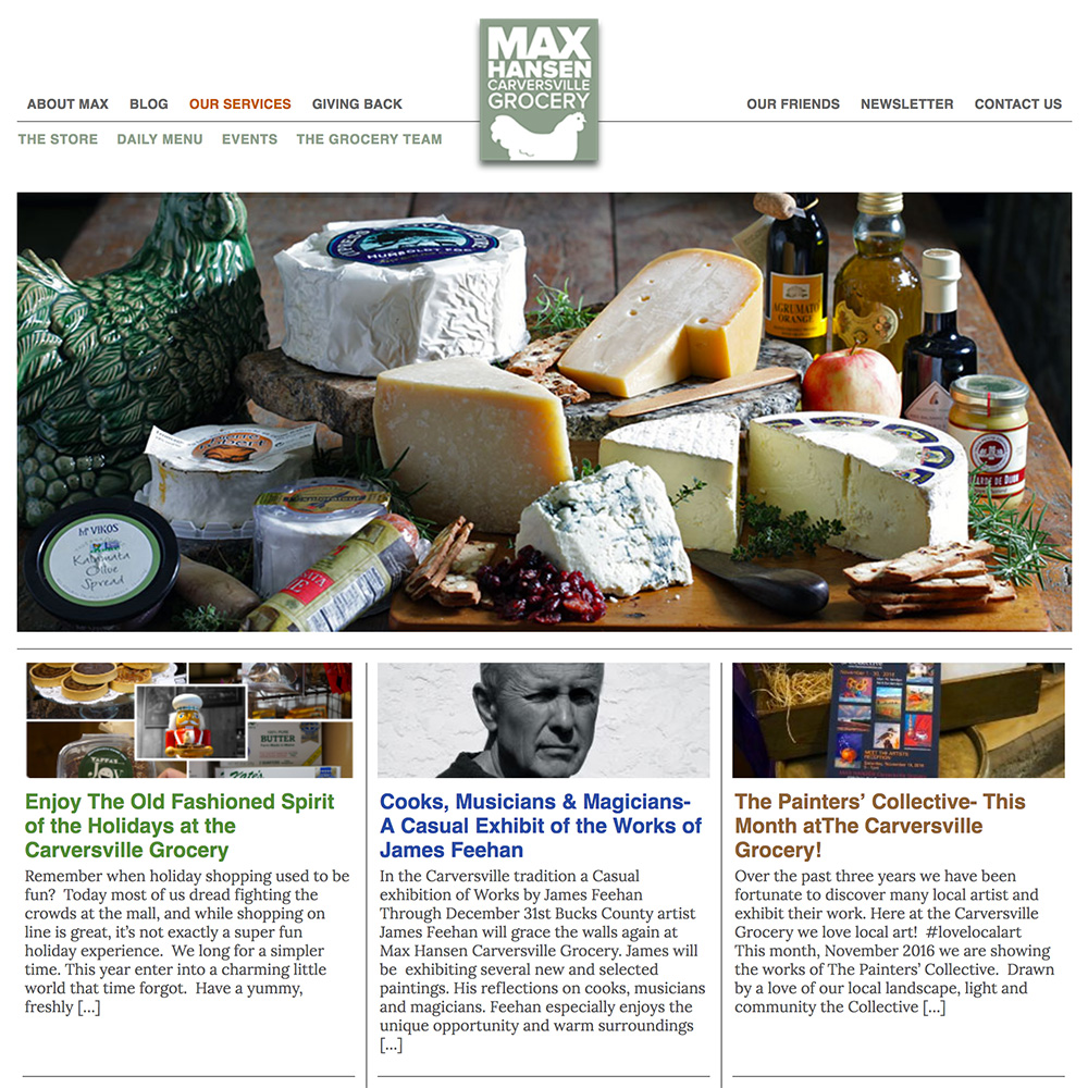
Web Site Max Hansen Grocery
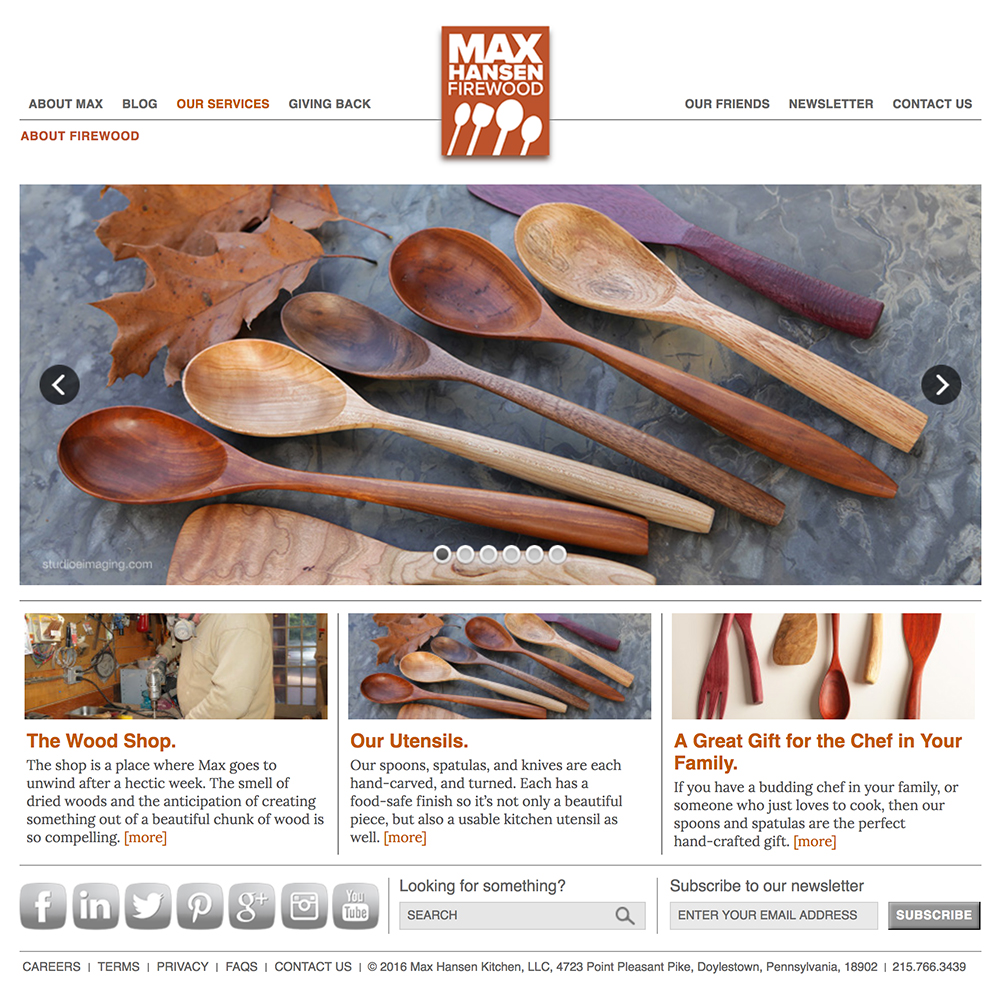
Web Site Max Hansen Firewood
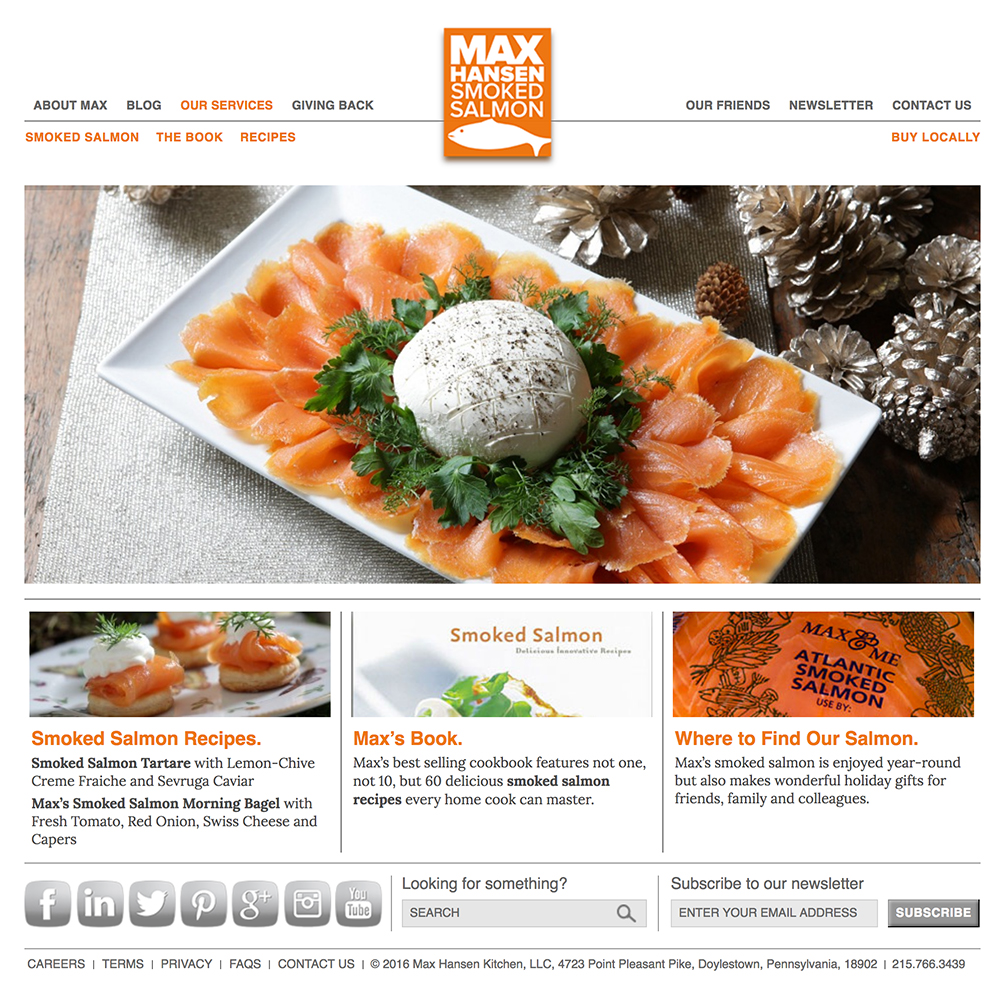
Web Site Max Hansen Salmon
The Max Hansen Website
We built separate sites for each of Max’s five businesses. Each one is customized to the particular audience, yet all five are designed to be part of the Max Hansen Kitchen brand family.


We’re an established marketing and design firm with over 40 years of experience in creating marketing solutions for companies like AstraZeneca, Dow Jones, Merck, and many others in a variety of industries from pharmaceutical to commercial real estate. In both print and digital, our creativity gets results.
© The Steve Williams Design Office, Inc.
FOLLOW US
MEMBER OF
American Institute of Graphic Arts
The Type Directors Club