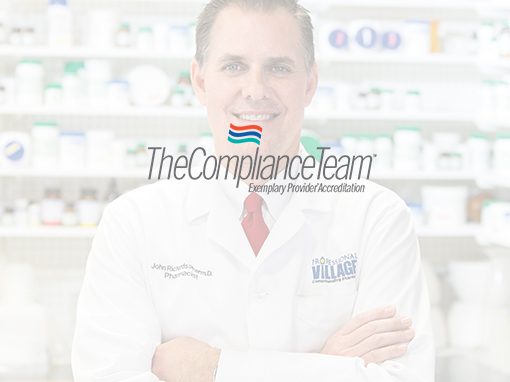
Logo design.
When The Compliance Team came to us, they wanted to take their 17-year-old company to the next level. They had created a Medicare accreditation organization with a national client list. But now it was time to create a more professional and memorable brand that could compete with “the big guys” in their field.

The Challenge
The Compliance Team wanted to change their image from a “mom and pop” to that of a strong, national, trustworthy accreditation organization who could compete with other accreditation firms throughout the country. The first step was to update the identity. We discussed how the logo needed to establish a consistent brand that here-to-for had not been implemented.
The Solution
The Compliance Team bases their accreditation process on the three fundamental characteristics of patient care: Safety, Honesty, and Caring. We developed a flag icon with three colors representing each of these characteristics. We selected an easy-to-read font, Helvetica Neue Condensed italic to convey a clean, contemporary brand.
Additional projects for The Compliance Team:


We’re an established marketing and design firm with over 40 years of experience in creating marketing solutions for companies like AstraZeneca, Dow Jones, Merck, and many others in a variety of industries from pharmaceutical to commercial real estate. In both print and digital, our creativity gets results.
© The Steve Williams Design Office, Inc.
FOLLOW US
MEMBER OF
American Institute of Graphic Arts
The Type Directors Club


