Logo update.
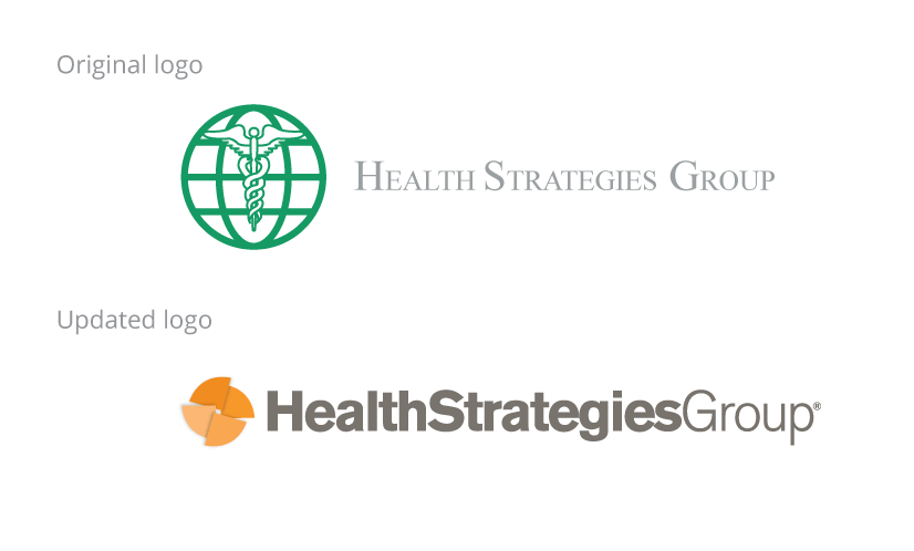
As Health Strategies Group began to grow they felt the need to update their brand beginning with a new logo.

The Challenge
Health Strategies Group was a successful, growing pharmaceutical research firm that felt the need to create a brand identity to set themselves apart from a number of new competitors. We were asked to create a logo that would concisely convey the company’s business in a bold contemporary style.
The Solution
A lot of what Health Strategies Group does involves displays of data, in line graphs, bar graphs and pie charts. For the brand icon, we looked at these informational graphics and created a pinwheel of pie chart segments that float to indicate the multiple levels of their business. We used Helvetica Neue Bold and Regular for a simple. clean, contemporary look.
Corporate brochure
The Challenge
Health Strategies Group requested a new corporate brochure and a corporate folder to use as a leave-behind and to send to new prospects.
The Solution
Instead of two pieces, we proposed a combined piece that could function as a pocket folder and company brochure. Then, instead of a pocket folder with the expected company logo on the front, we wrote an intriguing, yet contradictory headline that would be explained as the reader opens the folder. Inside is the payoff line used as the cover of the bound-in brochure.
Additional Health Strategies Group projects:


We’re an established marketing and design firm with over 40 years of experience in creating marketing solutions for companies like AstraZeneca, Dow Jones, Merck, and many others in a variety of industries from pharmaceutical to commercial real estate. In both print and digital, our creativity gets results.
© The Steve Williams Design Office, Inc.
FOLLOW US
MEMBER OF
American Institute of Graphic Arts
The Type Directors Club


