New identity.
This event has been a cornerstone of the US professional racing landscape for over three decades. When the time came to make a change in the name of the event, we were asked to design a new identity.

The Challenge
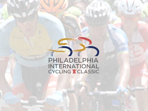
The race was to be called the Philadelphia International Cycling Classic. The city of Philadelphia was the new event sponsor. The only requirement was that the logo incorporate the city’s colors – red, blue, and gold – and of course, the liberty bell.
The Solution
Using simulated brush strokes, we created an icon that exemplified the speed of professional cycling. The gray Leto Sans font provides a clean, contemporary base to hold the required, iconic Liberty Bell.
Additional Philadelphia International Cycling Classic projects:


We’re an established marketing and design firm with over 40 years of experience in creating marketing solutions for companies like AstraZeneca, Dow Jones, Merck, and many others in a variety of industries from pharmaceutical to commercial real estate. In both print and digital, our creativity gets results.
© The Steve Williams Design Office, Inc.
FOLLOW US
MEMBER OF
American Institute of Graphic Arts
The Type Directors Club


