Logo update.
Lingraphica is communication software made for a laptop, tablet or smartphone that allows people suffering with aphasia to communicate. Using illustrations to depict day-to-day situations, Lingraphica provides an easy way for these people to convey simple ideas.

The Challenge
Lingraphica has used the same logo since the very beginning. When they asked us to explore an update of the logo, we began by looking at the legacy of this brand. After we explored a few new designs as requested, we urged our client to stick with the logo they had and tweak it a bit to make it more effective in digital media, and stronger in print.
The Solution
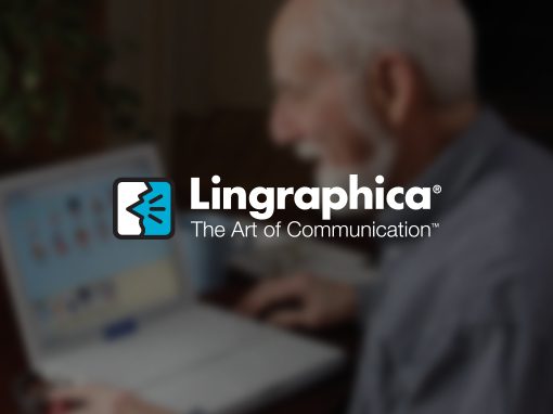
The most noticeable change to the logo was the relationship between the icon and the logotype. By simply changing the proportions, the name is now larger – the icon remained the same size. We then did a little tighter kerning to the logotype, giving it a more optically heavy appearance. We then strengthened the icon image of the speaking mouth by adding an outline to the face and beefing up the three lines that indicated speech. All the outlines in the icon are now uniform in thickness.
Additional Lingraphica projects:


We’re an established marketing and design firm with over 40 years of experience in creating marketing solutions for companies like AstraZeneca, Dow Jones, Merck, and many others in a variety of industries from pharmaceutical to commercial real estate. In both print and digital, our creativity gets results.
© The Steve Williams Design Office, Inc.
FOLLOW US
MEMBER OF
American Institute of Graphic Arts
The Type Directors Club


